
Illustration composition tips: what artists can learn from cinematography

You can learn more about cinematic composition in this Step-by-Step Guide and by reading this Cinematic Composition Challenge breakdown
Composition in illustration
After submitting my children's book illustration portfolio and receiving rejections in September, I took a hard look at my work. I realized that while my illustrations were technically sound, they lacked strong composition and dynamic storytelling. I wrote more about my findings on storytelling here and here.

Most of my illustrations played it way too safe—straight-on angles, eye-level views, and perfectly centered characters. Technically fine, but honestly? Kinda boring. They just felt... flat.
As a self-taught artist and lifelong nerd, learning is one of my passions. I’m also a huge movie buff and have always appreciated beautiful cinematography. Determined to improve my portfolio, I dove deep into understanding composition techniques for children’s book illustration. But instead of turning to traditional painting masters, I found inspiration on how to illustrate children's books in animated films and cinematography.
Why composition matters in children’s books
Illustration (especially in children’s books!) is all about storytelling. And composition plays a key role in that.
Where characters are placed in a scene, how close or far the viewer feels from them, and the overall flow of the composition can make the difference between an engaging, immersive story and one that falls flat. Good composition guides the viewer’s eye, conveys mood, and helps readers connect with the characters.
So, if my illustrations weren’t holding attention, I knew I had to fix my composition.
Composition: lessons from film and storyboarding
While I understood the basic rule of thirds from my landscape painting practice, that was about it. Wanting to push myself further, I turned to storyboarding techniques used in film and animation.
I rewatched my favorite animated movies with fresh eyes, pausing to analyze frames and asking myself:
Why does this shot feel powerful?
How does the framing enhance the character’s emotions?
What techniques make this scene visually interesting?
A valuable resource that really helped me was the YouTube video Ultimate Guide to Film Composition & Framing. It broke down how different compositional elements like shapes, angles, contrast, and negative space work together to tell a visual story.

Tips for improving composition in illustration
As I studied, I started applying what I learned to my own work. Here are key techniques that transformed my illustrations:
Experiment with angles and perspective
Instead of defaulting to eye-level shots, I started playing with different angles. Low angles make a character feel powerful, while high angles make them seem small or vulnerable. Over-the-shoulder shots create intimacy, and extreme close-ups focus on emotion. These small shifts instantly made my compositions more dynamic and engaging.
Use framing for storytelling
Rather than letting characters float in the middle of a scene, I started using natural elements to frame them. A character surrounded by tree branches can feel hidden or enclosed, while a silhouette in a doorway adds mystery or anticipation.
Control the viewer’s eye with leading lines
Roads, rivers, arms, or beams of light can naturally draw attention to key focal points. Diagonal lines inject movement and energy, while horizontal lines suggest calm and stability.
Contrast light and dark for mood
A bright character against a dark background immediately becomes the focus, while a dark figure against a bright scene creates tension or mystery. Gradients from light to dark can even help show a transition in the story.
Play with scale and spacing
A tiny character in a vast landscape can evoke adventure or loneliness, while tight framing builds tension or intimacy. Using these techniques together has made my illustrations feel more alive and layered, letting the story shine through visually.
Composition in action: a storytelling exercise
To put my new skills to the test, I created a simple story about a fox walking through the forest. This exercise forced me to experiment with different perspectives and compositions:

Frame 1: The fox enters the forest—shot from a straight-on view, establishing the setting.
Frame 2: A top-down view shows the fox navigating winding paths, emphasizing uncertainty.
Frame 3: A close-up of the fox’s face, peering between trees, conveys hesitation.
Frame 4: The fox moves deeper into the forest—the colors darken to reflect growing tension.
Frame 5: A close-up of the fox holding a compass, searching for direction.

Frame 6: A squirrel appears on a branch, watching the lost fox—hinting at a possible helper.
Frame 7: A close-up from the squirrel’s point of view, revealing the fox’s confusion while the squirrel looks inviting and curious.
Frame 8: The final frame—a wide shot of the fox and squirrel sitting together, enjoying tea, showing their freshly established friendship.
This exercise pushed me to think beyond static compositions. I wasn’t just illustrating characters—I was “directing” a visual story.
For example, in the frames where the fox is lost in the woods, I used color shifts to reflect his emotions. The warm yellows and greens gradually fade into cooler, desaturated tones, as if the forest itself is closing in on him. This change mirrors his growing doubt and uncertainty.
To emphasize that feeling even more, I tightened the composition and used a close-up. Instead of an open, expansive shot, we’re now right there with the fox—his face turned slightly to the side, his expression uncertain. The trees now surround him, making the space feel smaller, feeling almost like a prison cell. By changing both color and framing, I was able to amplify the fox’s emotions without a single word of text.
Resources for studying composition
If you’re looking to improve your illustration composition for children’s books, here are some fantastic resources that helped me:
Books
Children’s Picturebooks: The Art of Visual Storytelling – Martin Salisbury & Morag Styles
Framed Ink – Marcos Mateu-Mestre (great for understanding visual storytelling)
The Visual Story – Bruce Block (explores cinematography principles for storytelling)
Podcasts
3 Point Perspective (great for aspiring illustrators!)
Illustration Department Podcast (interviews with illustrators about their creative process)
You Are A Storyteller (focuses on storytelling principles that apply to illustration)
Films & Series with Stunning Composition
Spider-Man: Into the Spider-Verse (incredible dynamic angles and framing)
Wolfwalkers (masterful use of negative space and dynamic angles)
Coraline (brilliant use of contrast and perspective to create mood)
Klaus (masterful cinematography in animation)
What about you?
If you’re feeling stuck in your art, I recommend this exercise: find a movie still (I have a Pinterest board if that helps) and break it down. Ask yourself:
What makes it work?
What does it say about the characters’ relationships?
What mood does it convey?
What can you apply to your own work?
I’d love to hear from you! Have you ever studied film composition to improve your art? Do you have any favorite animated films with incredible composition? Share your thoughts in the comments!
Thank you for being here,
Mila
Do you know I sell Procreate resources like tutorials and brushes?
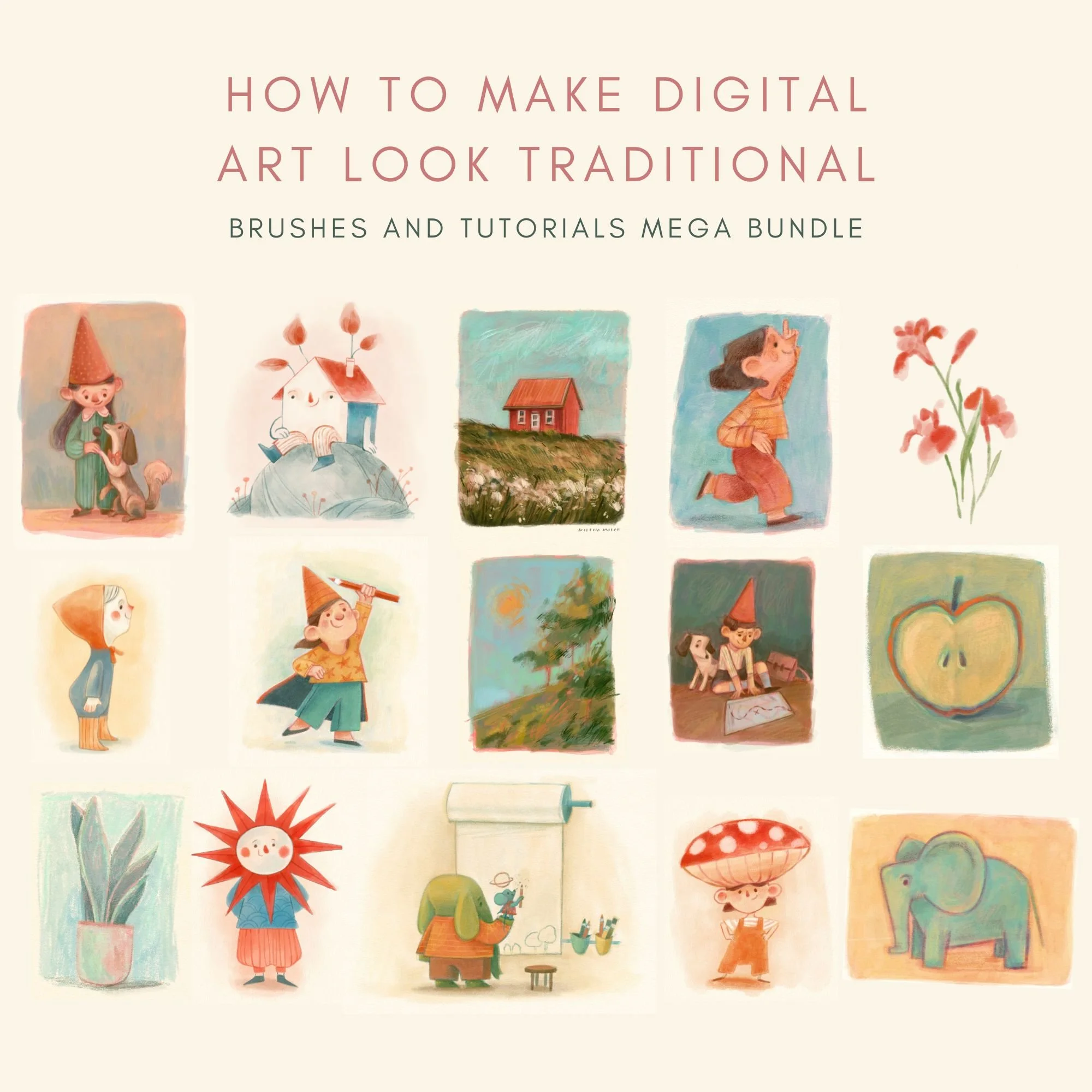
This bundle brings all of my Procreate resources together in one place. You’ll get 26 custom brushes and 7 in-depth PDF tutorials, designed to help you achieve a soft, textured, traditional look in your digital illustrations.
If you love the warmth of watercolor, ink, gouache, or colored pencils but work digitally, this bundle is made to support both your tools and your process. Instead of just giving you brushes and leaving you to figure things out on your own, this bundle shows you how I actually use them in my own work.
It’s especially suited for children’s book illustrators, mixed-media artists, or anyone who wants their digital paintings to feel more organic, textured, and handmade.
What’s included:
Procreate Brush Sets (26 brushes total)
You’ll receive two full brush sets designed to mimic traditional media:
The Wet Media Brush Set (12 brushes) focuses on the softness of watercolor and ink. It includes dedicated liners, a smudge tool brush, and a textured eraser to help you achieve a more organic look in your digital work.
The Mixed Media Brush Set (15 brushes) is designed to reflect the textures I love most: the creaminess of gouache, the grainy feel of colored pencils, and those happy little accidents that make traditional art feel human.
Both sets also include:
High-resolution cold-pressed paper texture to add a warm, hand-painted feel
A curated color swatch with the hues I use in my own paintings
2 detailed PDF guides explaining each brush and walking you through my step-by-step painting approach
Procreate Tutorials (5 PDF files)
Alongside the brushes, you’ll get five in-depth tutorials that show how to bring a traditional look into your digital workflow:
How to mix colors in Procreate: My method for blending colors directly on the canvas and creating harmonious palettes.
How to test color palettes: An introduction to color theory and a practical guide to build cohesive palettes in Procreate.
Elephant and Mouse (soft pastel): A step-by-step tutorial focused on achieving a soft, pastel-like finish.
Girl with a Flower (mixed media): Learn about layering, texture, and how to preserve those happy accidents in digital painting.
Watercolor House (digital watercolor): A guided lesson on blending and painting translucent watercolor textures.
This bundle brings together all of my Procreate brushes and tutorials (worth €55) in one complete package for €39
Disclaimer: Brushes are designed for use with Procreate and may not be compatible with other software. Results may vary depending on individual drawing styles and techniques. Redistribution, reselling, or sharing of the brushes or tutorials is not permitted.