
Composition in illustration: lessons from a Pulp Fiction scene
Hey there, it’s me again! Remember when I wrote about analyzing movie stills and cinematography to improve my composition in illustration, especially for picture book spreads? My original plan was to share at least one movie still per month and turn this into a more structured series. It’s taken me a bit longer to get back to it because I was busy working on my Procreate brush, but I’m finally here!
In my last article, I broke down a scene from The Sopranos and turned it into a children’s book-style illustration. If you missed it, you can read that breakdown here. It’s a good one if you’re exploring picture book composition or building a children’s book portfolio.
Lately, I’ve been pushing myself to get better at composition, and one of the most helpful things I’ve found is studying movie stills. Read more about why that helps in this post.
So I asked in my Substack chat what movie stills we should choose. The options were:


The crowd had spoken and this time we’re going to analyze a still from Pulp Fiction. I’ll follow the same process and break it down for you, step by step. This kind of exercise has really helped me see composition through a new lens. One that’s both cinematic and story-driven, which is so important for children’s book illustration.
So… let’s go!
Step 1: How does it make me feel?
What’s the mood of the scene? Is it calm, tense, happy, sad, etc.?
Who are the key figures in the scene? What stands out about them (expressions, body language)?
How do elements like color, lighting, and set design affect the mood and atmosphere?
This scene from Pulp Fiction feels very different from the one I studied in The Sopranos. While that one had multiple characters interacting, this one is all about solitude.
We see a little boy sitting cross-legged in front of an old TV, in a vintage-looking room full of afternoon light. The colors are soft and muted, all within warm orange tones. The scene feels almost intimate, and the wide shot creates a sense of solitude.
The boy has his back turned, which adds to the feeling of distance. It’s a POV where we’re witnessing an alone moment. He seems to be absorbed in the cartoon he’s watching.
Before diving deeper into the analysis, I reminded myself not to let the movie’s context influence my interpretation too much. I already know what’s about to happen in the scene and why the boy looks like he’s about to turn around. But for this exercise, I focused on how the scene works visually, on its own, rather than what I already knew was coming.
Step 2: What composition rules do I notice in this illustration?
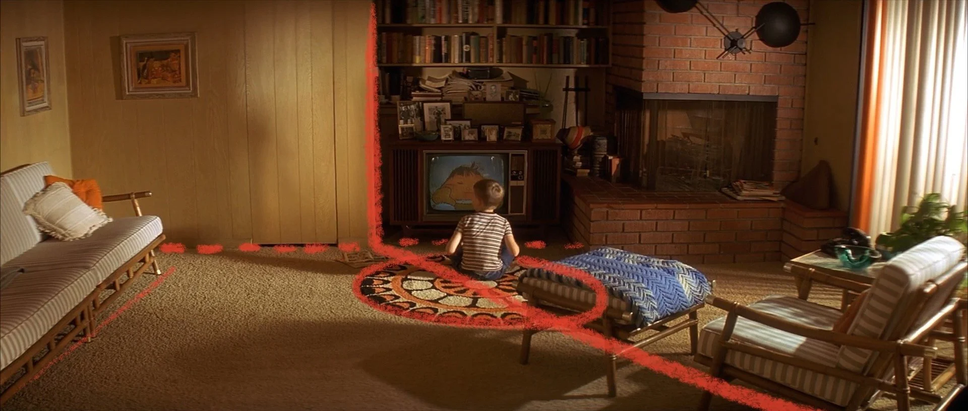
This is a wide shot, with the kid placed in the center at eye level. The circular rug he sits on acts like a spotlight, drawing the eye directly to him (it’s almost like a stage!). This is such a clever trick! I will definitely use it in the future. Everything in the room seems to point back to the center, especially the way the armchair frames him on the right side.
I also noticed the asymmetry created by the armchair. It’s placed off-center to the right, introducing a diagonal division of the room. This negative space is key. There’s an opening on the left, bright side that hints that someone else may enter the room (which, in the movie, is exactly what happens)
All these cinematographic tricks like the framing, asymmetry or the use of light are exactly what I look for when studying composition in illustration. They’re subtle, but speak more than a thousand words.
Step 3: How can I adapt this for a picture book spread?

How can I keep the same composition structure but change the characters and setting?
What details can I stylize to add a bit of playfulness?
I really love the isolated atmosphere of the original, but I wanted to bring more interaction into my illustration. I thought it would be fun to give the boy a companion. So I decided on a dog. I mean, nothing can go wrong if there’s a dog, right? I roughed out the idea and went into the last step, which is…
Step 4: Make it my own

What characters will I introduce? How will they interact with the scene?
How can I use gestures and expressions to tell the story through my illustration?
What fun details can I add to make the scene feel more alive?
I kept the boy in the center of the room, maintaining a bit of that wide, open feeling. But I changed the setting from a living room to a kid’s room. In my opinion, it made the scene feel a bit more tender and playful. The boy and the dog now feel like good friends.
I also thought about background details. The room could still have bookshelves like in the movie, but with more fun and childlike touches: plushies, books, maybe kids’ drawings taped to the walls. I kept the window in my sketch like in the Pulp Fiction scene. Could be fun to use that same atmospheric light!
This is the part I love most. Taking inspiration from a movie no one would consider a kid-friendly and changing it until it fits a picture book theme. I think that’s the beauty of studying composition as a storyteller.
How about you?
Have you tried analyzing a movie scene yet? I’d love to hear about your experience! Let me know what you think of this breakdown, and if you’ve been inspired to create your own!
And if you're interested in more behind-the-scenes posts like this one, plus resources for building your children's book portfolio, you can sign up for my newsletter or follow me on Substack!
Until next time!

Join my Art Club!
Want to join my art club to learn and draw together?
You’ll get a monthly Procreate guide, sketchbook prompts, behind-the-scenes stories from my portfolio journey, and an invite to our drawing hangouts on Zoom.