
Meaning of color in art
Explore my other articles on the sketching process and visual storytelling in my illustrations.
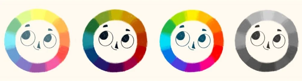
When I first started out as an illustrator, I had a major preference for blue. Why? Simply because it’s my favorite color! I found myself defaulting to cool tones and blue dominant palettes for almost every piece. I loved the consistency of having a signature color palette, but I quickly realized it was limiting my storytelling. Certain emotions or key moments just didn’t come across as powerfully with a blue heavy palette.
Over time, I’ve come to realize that color isn’t just about making things look pretty. It’s about emotions, highlighting important moments, and even looking deeper into a character’s thoughts and journey. In other words, color is one of the essential building blocks of storytelling.
In this post, I’ll explain how I use color in my own work, why it’s so crucial, and how understanding hue, temperature, value, and saturation can help you tell a more compelling story.
I let blue go
When I first started out blue showed up in almost everything I painted. Over time, I began experimenting with warmer colors like orange, red, yellow, and I was surprised by how much they changed the mood of my work. Those warmer tones helped me to add more depth and variety to my portfolio.
I still find myself drawn to blue, but now I’m more aware of what it’s doing in a scene. I’ll add warmer tones when it feels right, sometimes to create a cozy atmosphere, other times to make a character look joyful or full of life.
That doesn’t mean having a signature palette is a bad thing. Many amazing artists are known for their consistent use of color. But if you’re still figuring out your style, try not to box yourself in too early. I definitely did. I was so focused on keeping my colors consistent that I didn’t realize how much they could deepen the story I was trying to tell.
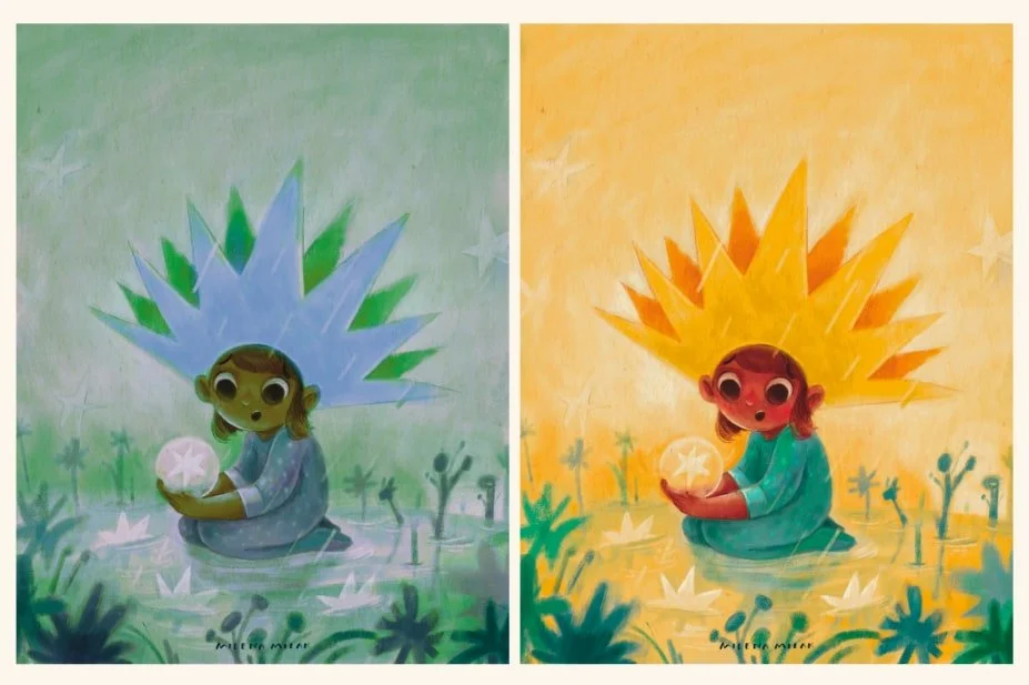
Notice how playing with colors changed the vibe of the illustration?
Hue color definition
Let’s start with the basics. A hue is just a color in its purest form, like red, blue, or yellow. These are called primary hues, and they can’t be made by mixing other colors.
When you mix two primary hues, you get secondary hues, like green, orange, or purple. Then there are tertiary hues, which come from mixing a primary and a secondary, giving you colors like blue-green or red-orange.
In short, hue is the basic family a color belongs to, the starting point for everything else in your palette.
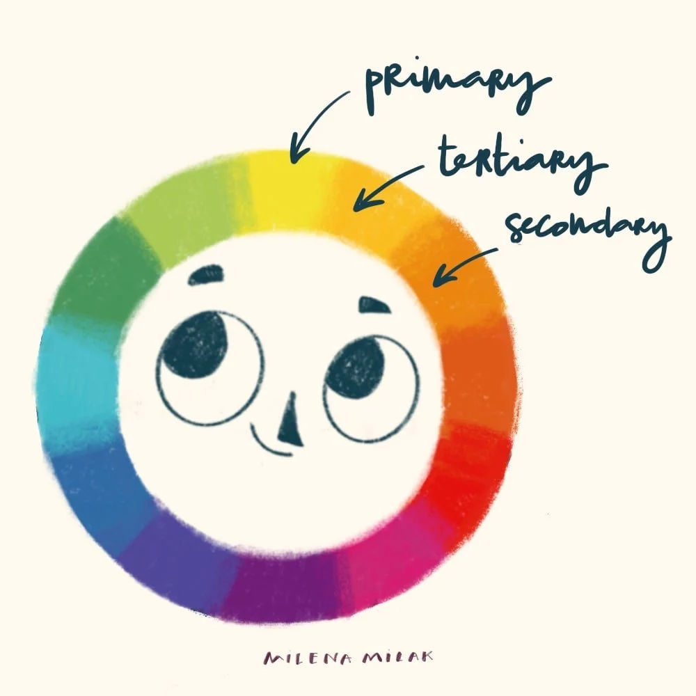
Hues set the stage for everything. Once you understand them, you’ll be better at creating a mood for your illustrations.
Warm and cold colors
Warm colors like red, orange, and yellow feel bright and energetic. They can make a scene or character feel happy, excited, or full of warmth.
Cool colors, such as blue, green, and purple, have a calming, subdued quality. They work well for conveying sadness, melancholy, or a sense of mystery.
For example, in a forest scene, using warm tones can make it feel cozy and inviting, while cool colors can give the same scene a more reflective or even slightly eerie atmosphere.
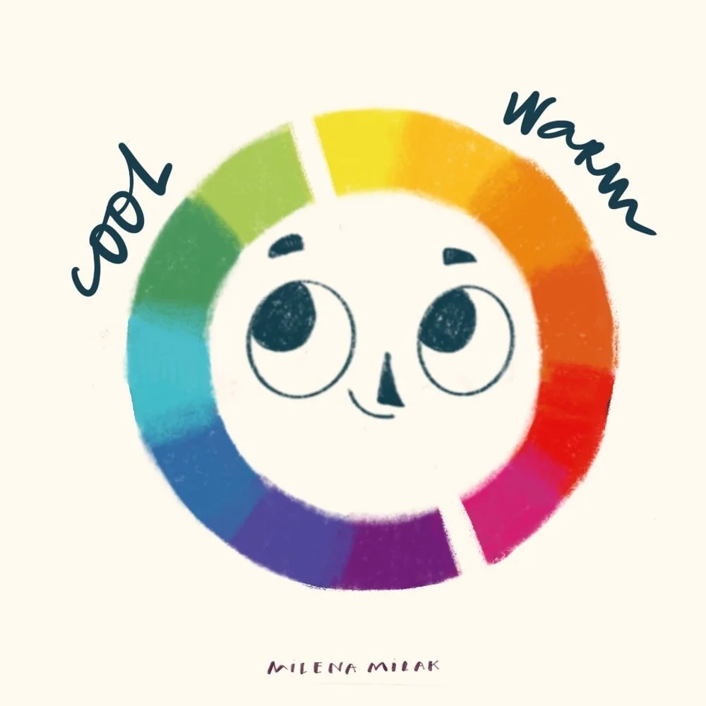
Color temperature plays a huge role in how a scene feels.
Color value: lightness vs. darkness
Light values, like pastels, feel soft, gentle, and airy. They can give a scene a sense of openness or calm.
Darker values, on the other hand, bring drama, tension, and mystery. A dark navy, for example, can make a scene feel magical or intense, while a light blue might feel peaceful and serene.
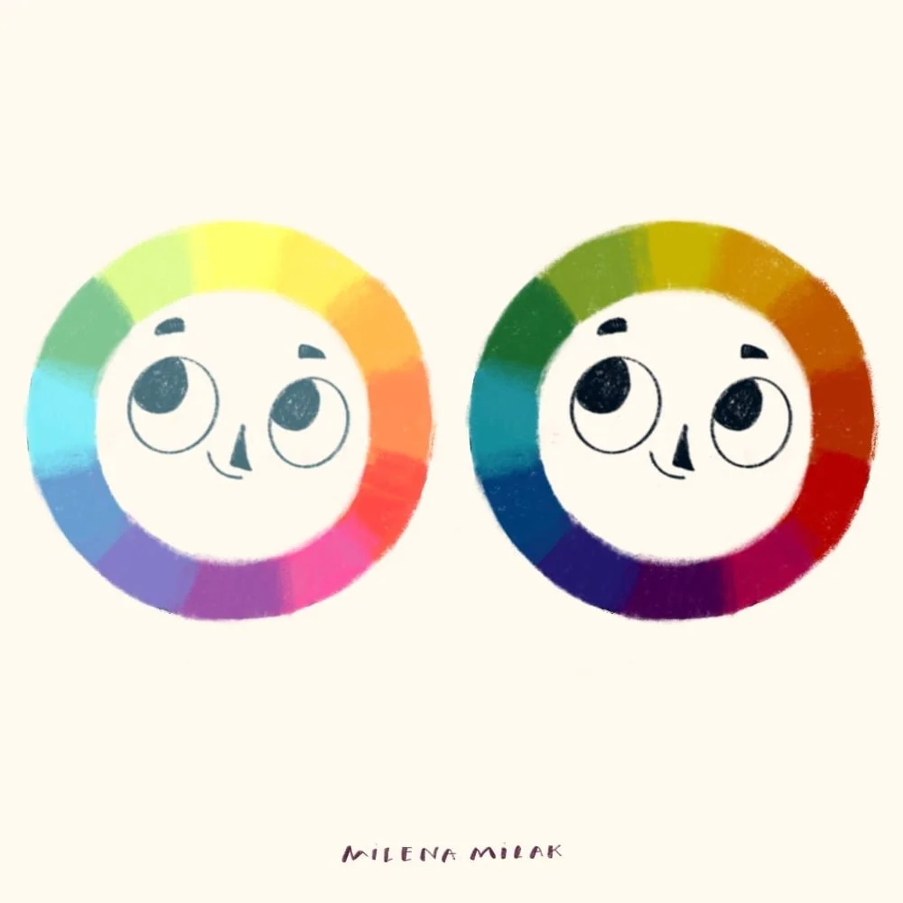
Value refers to how light or dark a color is. It can completely shift the mood:
What is saturation in color
Saturation is how intense or vivid a color appears.. Highly saturated colors immediately grab attention and feel full of energy. They make a scene or character feel lively and bold.
Lower saturation colors are more subdued and calming. If you want a grounded, nostalgic vibe, muted tones like rusty red or mustard yellow can add warmth without overwhelming the viewer.
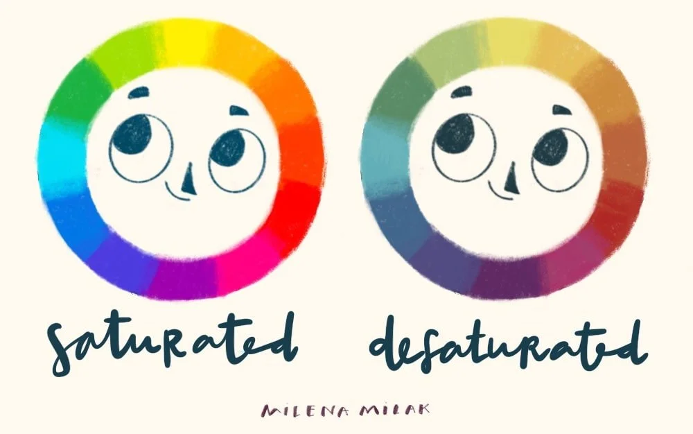
Saturation is about how vivid or muted a color is.
How does color affect emotions in art?
Let’s take yellow as an example. It’s such a fascinating color because small shifts in its tone or brightness can completely change the feeling it gives off.
Pure, bright yellow usually feels energetic and optimistic. It’s the color of sunshine, creativity, and attention. No wonder it’s used on warning signs and labels; it grabs your eye instantly. When that yellow leans more golden or mustard, it feels older and wiser somehow, richer, more elegant, even luxurious.
A warm yellow, like the glow of late afternoon light, feels comforting and familiar. It makes a space or an image feel inviting. Cooler yellows, on the other hand, those pale, sandy tones you see in desert landscapes, carry a sense of calm and openness, like wide, quiet spaces.
Light yellow has a gentle, airy quality, a bit like lemon sorbet or soft butter. Darker, deeper yellows bring weight and tradition. They feel established, grounded, even a little formal.
And then there’s saturation. A vivid, highly saturated yellow is loud and full of life. It demands attention. It’s excitement and optimism in color form. But once you mute that yellow a little, it softens. It feels vintage, nostalgic, and soothing, like something worn-in that holds a bit of history.
Color theory and psychology
Just as colors shift in tone and temperature, stories evolve too. When a character changes, grows, or faces challenges, the colors around them can move through their own emotional journey.
Bright, warm colors might capture the spark of optimism at the beginning of a story, when everything feels possible. As the character faces conflict or doubt, those colors might fade into cooler, muted tones that reflect uncertainty or introspection. Then, when the moment of growth or realization arrives, bold, saturated hues can return—stronger and more meaningful than before.
I love how Beatrice Blue plays with this idea in her illustrations. She uses color to echo what her characters are feeling, letting emotion drive the palette. Her work is a beautiful example of how color can evolve alongside a story. You can check out her work here.
Psychological meaning of colors in art
Color is one of the most powerful ways to show emotion in a story. The right palette can reveal how a character feels, build tension, or mark emotional change without a single word.
I often use warm and cool colors to reflect a character’s inner world. A warm, golden yellow can suggest hope or comfort, while a cool teal might hint at sadness, uncertainty, or distance.
When I want to add suspense or mystery, I turn to darker tones like deep blues, muted purples, or smoky grays. These colors make a scene feel heavier, as if something is about to unfold.
I also love using color transitions to show character growth. A story might begin with bright, lively colors that fade into muted tones as the character faces challenges. By the end, those warm hues can return, stronger and more saturated, to mirror resilience or newfound confidence.
Switching between warm and cool tones is another simple but powerful way to create emotional contrast. Warm colors feel energetic and full of life, while cool colors bring calm, distance, or quiet reflection. Together, they let you paint not just what’s happening, but how it feels.
Color and emotion
You don’t always need text to show the complexity of a character's journey. Try adjusting hues, temperature, value, and saturation instead! Remember, color isn’t just about making your artwork look pretty. It’s about helping to tell the story. The right use of color creates a deeper connection between the readers and your characters.
What’s your go-to color palette when illustrating? Do you find yourself sticking to certain hues, or do you switch it up depending on the mood of the story?
Thank you for stopping by,
Mila
Procreate resources
If you’re a Procreate artist and look for inspiration how to make your digital art look more traditional, I added some resources to my shop. Take a look!
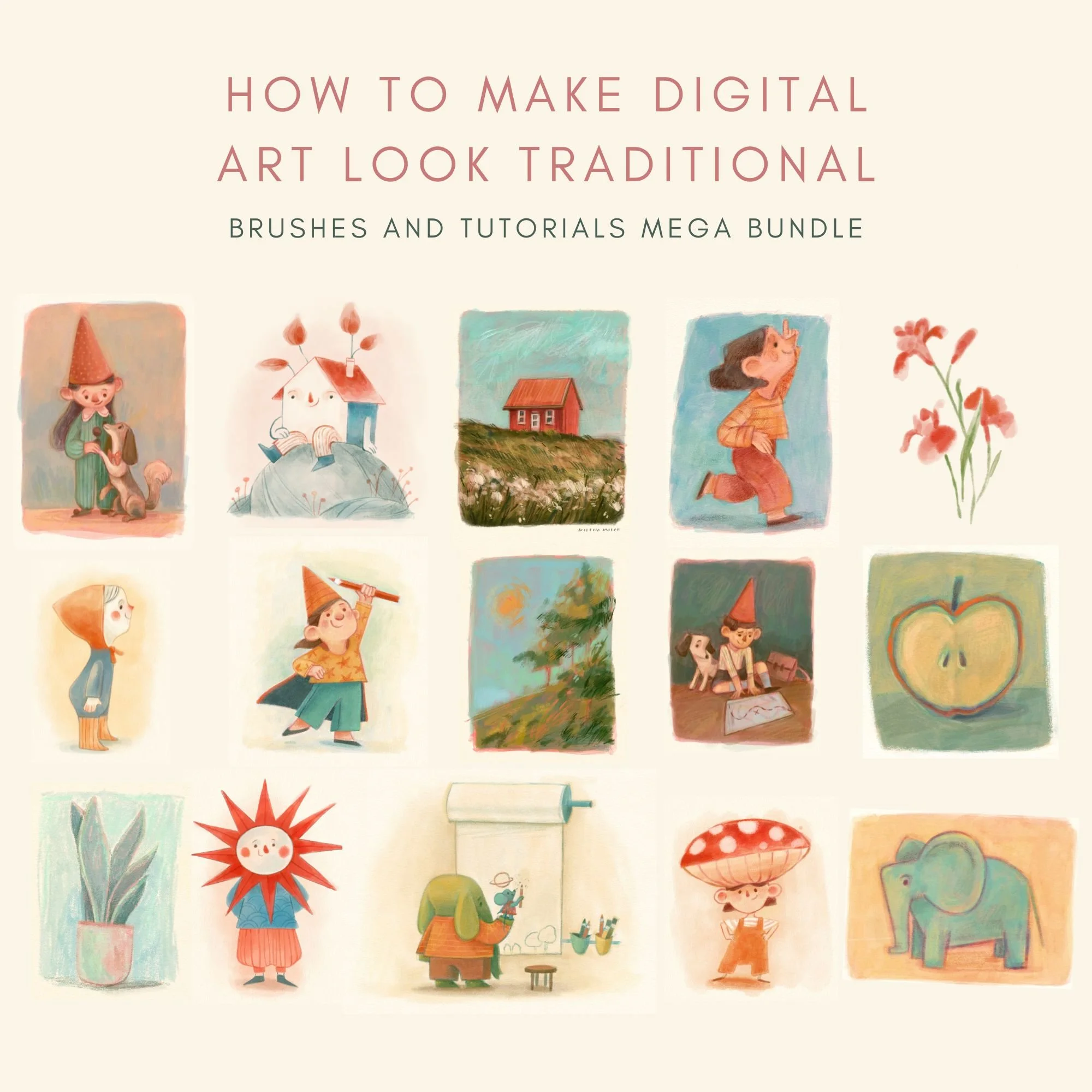

This Procreate brush pack is designed for artists who want their digital work to feel more like traditional drawing. Every brush is built to recreate the natural grain and subtle imperfections of pencil, charcoal, colored pencil, soft pastel, and oil pastel.
Instead of flat or overly polished digital strokes, you get texture, depth, and variation that feels closer to working on real paper.
This traditional media Procreate brushes set is built for illustrators who want expressive, hand-drawn results and is especially useful for children’s book illustration style.
What’s Included?
With this brush set, you’ll get
12 custom brushes designed to behave like traditional tools
A high-resolution cold-pressed paper texture for adding a warm, hand-painted feel to your artwork.
A curated swatch of my favorite colors—the same ones I use in my digital paintings.
A detailed PDF guide that walks you through each brush, its best uses, and a step-by-step breakdown of my painting process.
Disclaimer: The brush is designed for use with Procreate and may not be compatible with other software. Results may vary based on individual drawing styles and techniques. Redistribution, reselling, or sharing of the brush is not permitted.