
Create mixed media look in Procreate (+ tips on focal point, complementary color palette and so much more...)
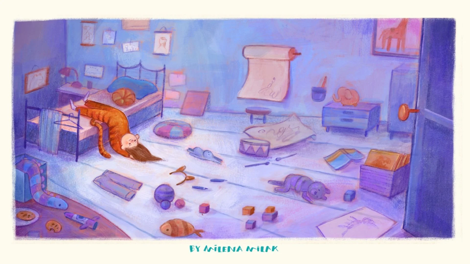
Lately I've been feeling pretty confident about how my characters and colors work together, but I still have a lot to improve when it comes to illustrating more detailed scenes and environments. So I signed up for an illustration mentorship to help me work on exactly that!
What I'm sharing with you today is the very first assignment I got. The goal was to illustrate an emotion using both a character and their environment.
It didn't take me long to decide, because I've had this idea of illustrating the bored child pose for quite some time already. I don't know about you, but I find this pose just too funny! So here we are: there's a bored kid in a room full of toys and objects, and no matter how hard they've tried to entertain themselves... they're still bored.
In this post I'll walk you through my whole process, from references to final textures, and share what I learned about storytelling, composition, color and protecting your focal. Let's go!
What I used: Procreate, the Gouache brush from my Mixed Media brush set, and the Crayon brush from my Dry Media brush set.
Step 0: Gather references
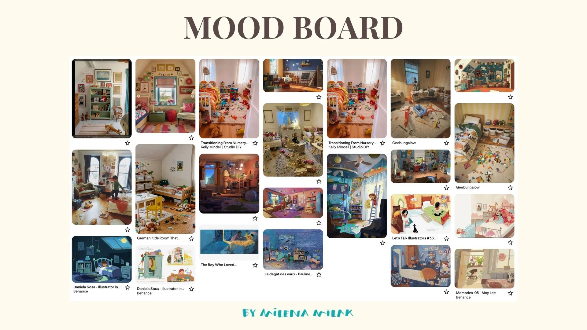
Before I started sketching, I collected some references on Pinterest. After a chat with my mentor, I want to be more mindful about using references instead of relying only on memory. I looked for messy children's rooms with toys lying around on the floor and searched for little ideas I could borrow for my own illustration.
Step 1: Plan the composition and the story
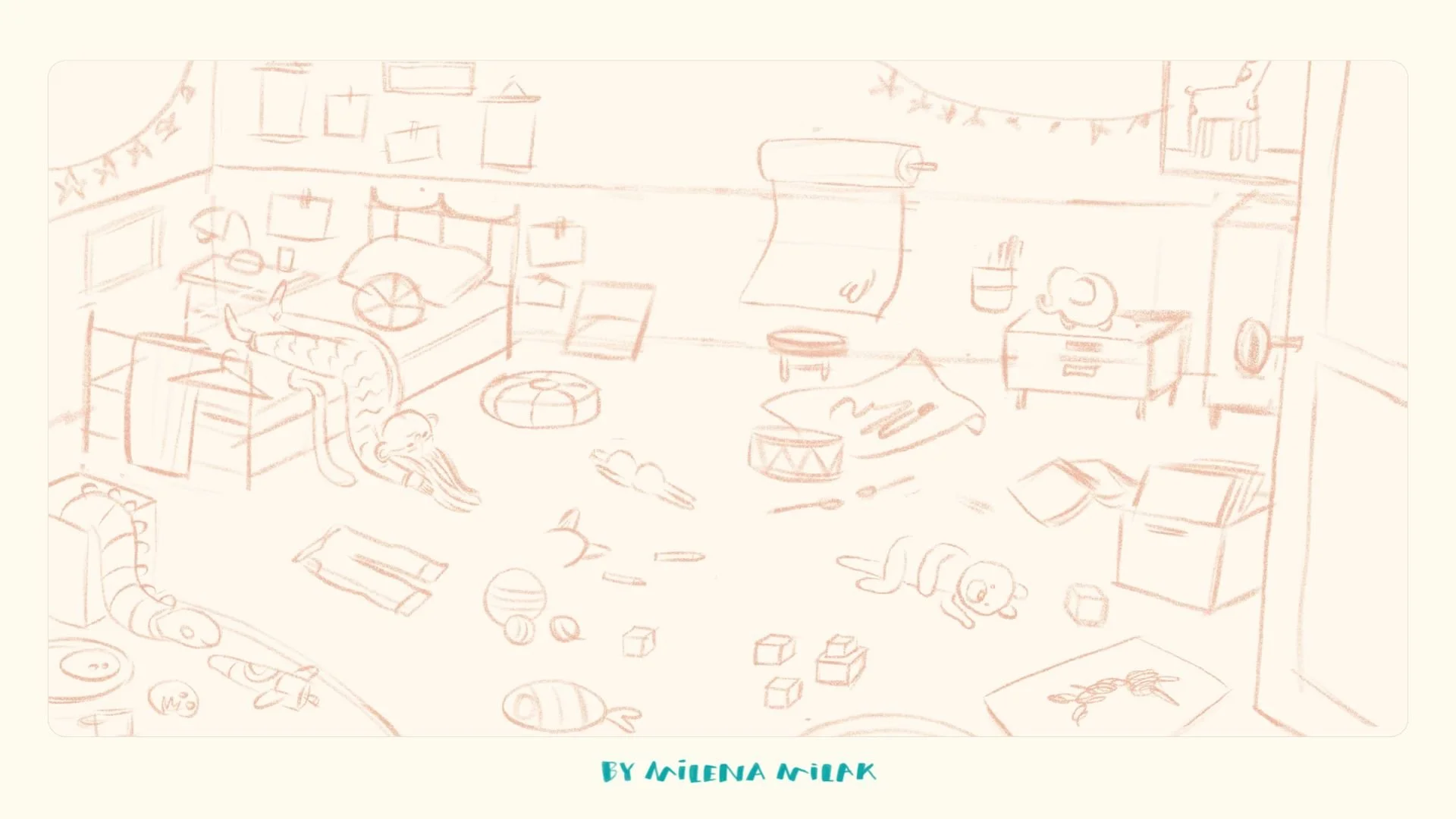
I spent quite a bit of time thinking about the composition. One thing I knew was that I wanted to avoid an eye-level, straight-on view and play with a more interesting perspective.
After doing my Cinematic Composition workshop breakdowns, I wanted to experiment with foreground, middle ground and background to create a stronger illusion of depth. That's why I added the open door and the table with the snake toy in the foreground.
This assignment is all about how the environment is part of the story too. So instead of drawing a generic bedroom, I wanted every object to add a little to the feeling of boredom. The toys and objects scattered around should feel like they've all been played with and abandoned by the girl in the tiger pyjamas (let's call her Lucy, shall we?). There are unfinished drawings, an open book, teddy bears left behind, and half-eaten cookies.
It's almost like you're able to retrace everything Lucy tried before finally giving up and collapsing on the bed.
I don't usually include this many details, so I'm definitely challenging myself here, but I'm really enjoying it.
Step 2: Pick a complementary color palette
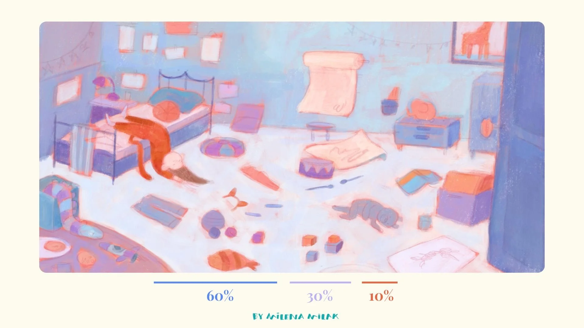
I loosely follow the 60–30–10 rule: roughly 60% of the painting in a main color, 30% in a secondary color, and 10% in an accent. For this illustration I wanted to keep most of the painting in blue and purple hues while using orange for the details and Lucy herself. I love using complementary color palettes for contrast, and orange will stand out against the purples and blues just perfectly!
Even at this early stage I already mark that the orange I use for Lucy should be darker and much more saturated than any other orange in the painting. I want whoever looks at the illustration to notice her first. If Lucy doesn't stand out, the feeling of boredom won't stand out either!
Step 3: Underpainting and the value check
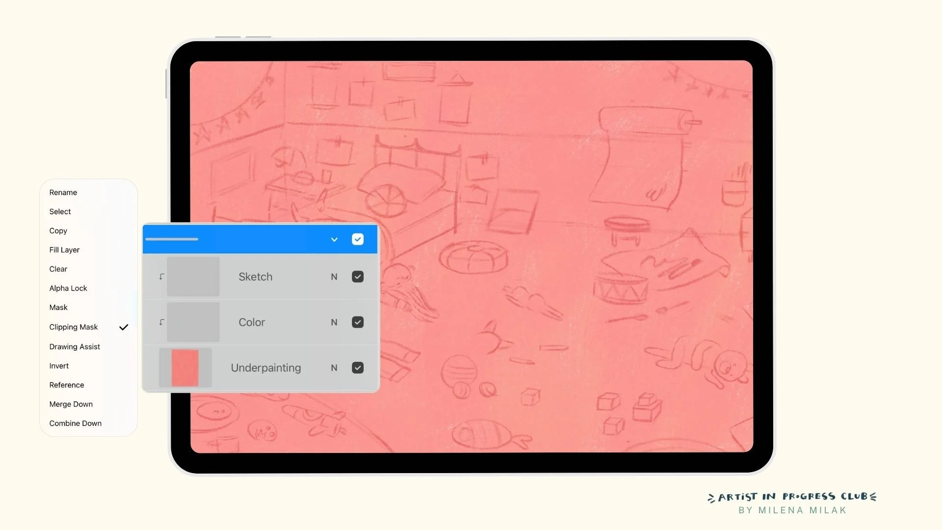
As always, I start with an underpainting layer. I usually go for warm oranges or reds.
I used to paint everything directly on the underpainting layer with Alpha Lock turned on, but lately I've changed my process a little. Now I add a new layer on top and set it as a Clipping Mask. Effectively, I work with three layers: the underpainting, the color layer and the sketch layer (which I'll merge with the color layer later).
Why the change? Sometimes it makes it much easier to fix imperfections in the underpainting without affecting everything else.
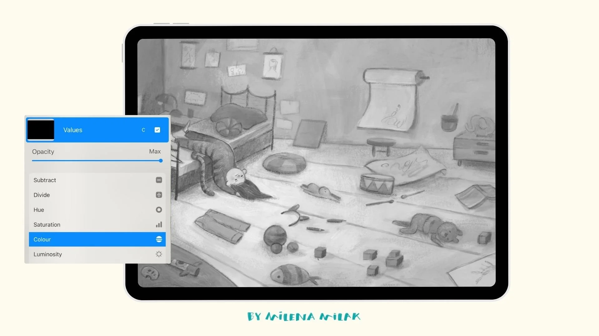
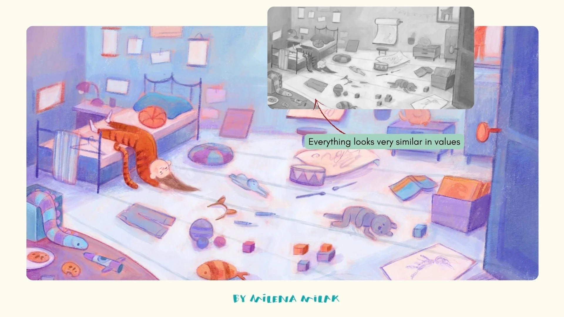
Tip: check your values as you paint. One habit I've developed over the last few years is constantly checking my values. Add a new layer on top, fill it with pure black, and change the blend mode to Color. This lets you see the painting in grayscale. If all the values are too similar, nothing attracts our attention. I always make sure there's enough contrast to keep the focus on the main subject, which in this case is Lucy.
Step 4: Flat colors with a gouache brush
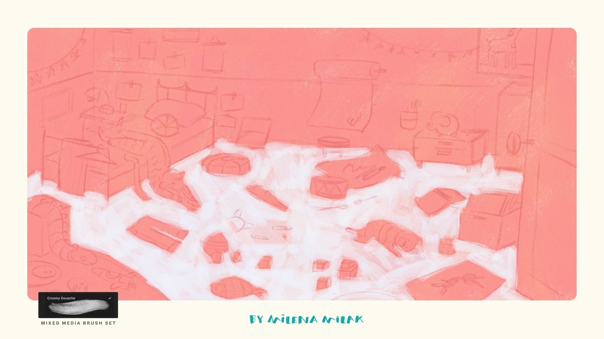
Now it's time for the first layer of color. I lower my brush opacity to around 80–90% because I still want some of the underpainting to show through.
This time I used a brush I hadn't touched in a while: the Gouache brush from my very first Procreate brush set, Mixed Media. I've been so focused lately on experimenting with dry textures that I'd almost forgotten about it. Coming back to it felt a bit like picking up an old art supply and remembering why I loved it in the first place!
Before adding the rest of the colors, I manually paint a lighter color on the floor. I already know that most of the room will end up fairly dark, especially the walls, so I want the floor to stay bright. I also don't want the floor itself to compete with everything that's scattered across it. At this stage I also begin introducing subtle color variation by picking colors directly from the canvas and shifting them slightly.
Step 5: Build up texture with a crayon brush
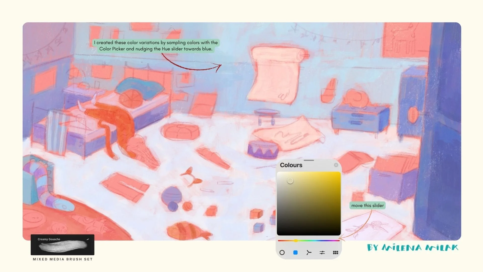
I always work bit by bit across the whole painting instead of finishing one section before moving to the next.
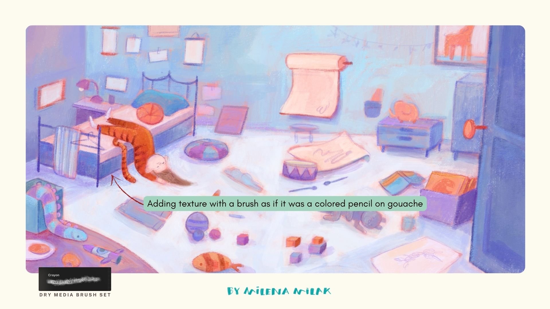
Now that the first digital gouache layer is finished, it's time for my digital "colored pencils", which in this case is the Crayon brush from my Dry Media brush set. I slowly build texture across the whole illustration while keeping one thing in mind: Lucy should remain the darkest and most saturated part of the painting.
Areas around Lucy receive more contrast, more texture and sharper edges, while less important areas stay simpler. Texture works just like detail: if everything is equally textured, nothing feels special anymore.
Step 6: Protect the focal point with a vignette
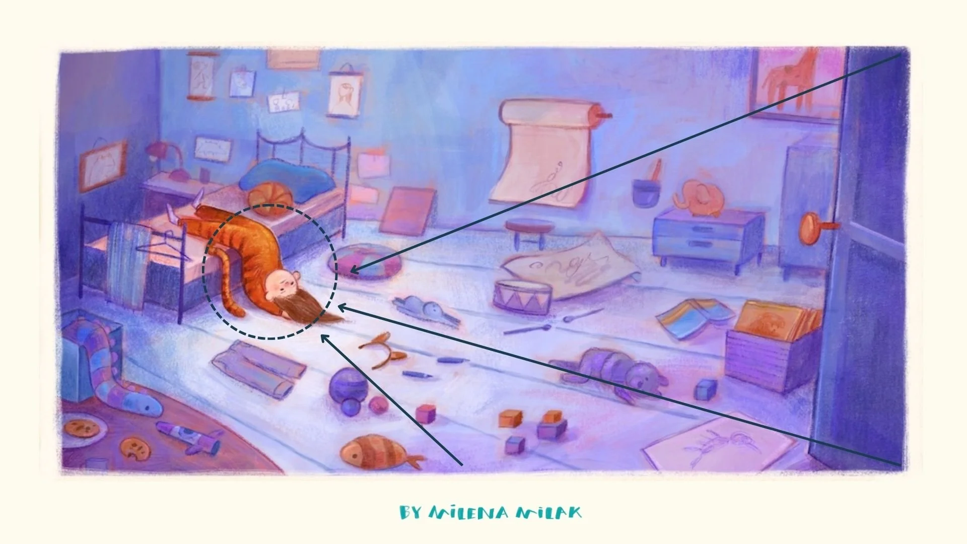
With so many objects in one illustration, I wanted to make sure Lucy and her boredom stayed in the spotlight.
After another value check, I noticed that everything felt a little too similar and Lucy wasn't standing out enough. So I used a little trick I would also use in traditional painting: adding a subtle vignette.
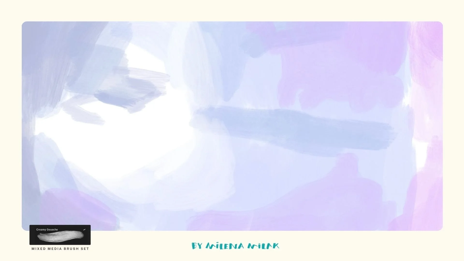
With traditional paint I'd use a very thin layer of diluted paint. Digitally, I just add a new layer, set it to Multiply, lower the opacity, and paint loose, expressive brush strokes all around Lucy and her bed. I really like how the brighter floor creates a little halo around her head!
Here's a preview of the layer I set to Multiply. I instantly merge those two layers and continue with adding more defined lines and textures.
If you like this step-by-step post, I share a new Procreate tutorial every month in my Artist in Progress Club on Patreon.
Step 7: Final textures
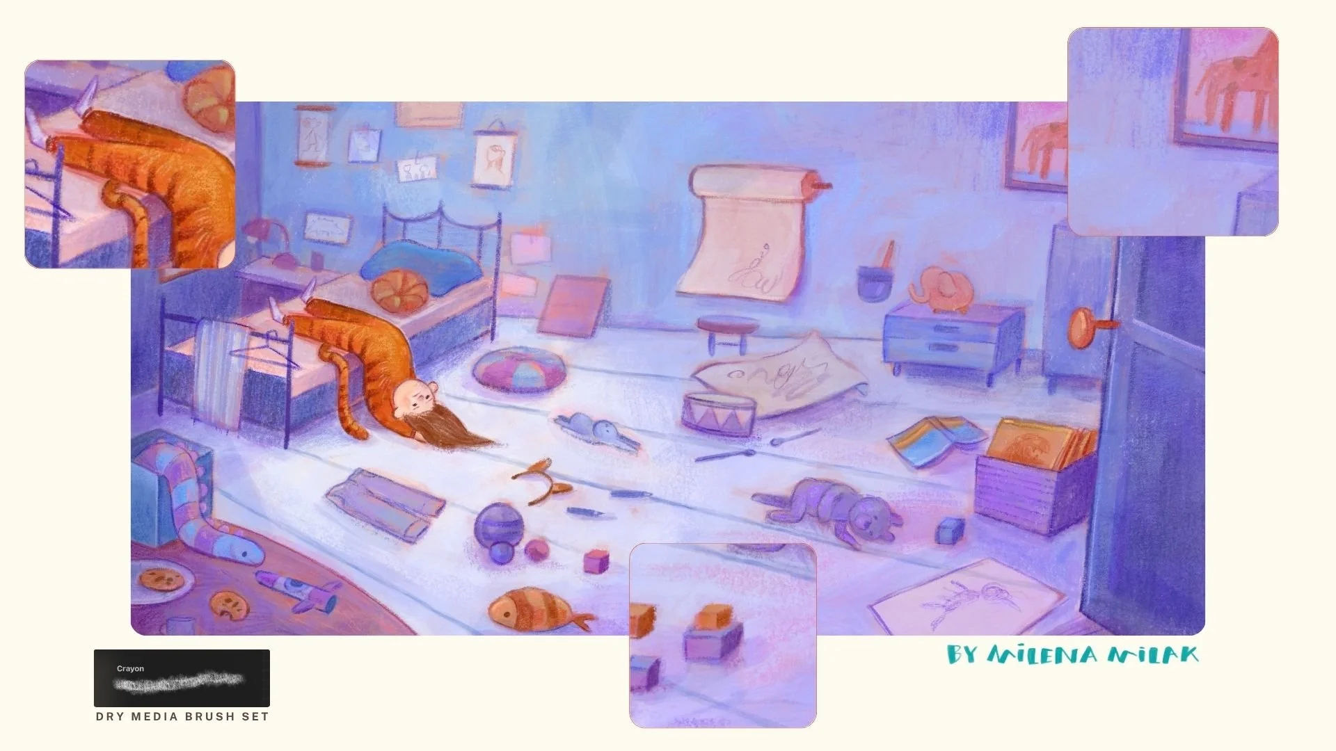
From this point on, I mostly work with my Crayon brush, slowly adding texture across the whole painting.I keep checking my values to protect the focal point and pay extra attention to Lucy's pyjamas because I want them to stand out as much as possible.
I don't use any blending modes here. Instead, I pick colors directly from the canvas and slightly shift the hue. Sometimes I lower the brush opacity for a softer effect. I also sprinkle in some pinks and oranges to make the painting look less monochromatic.
The final illustration
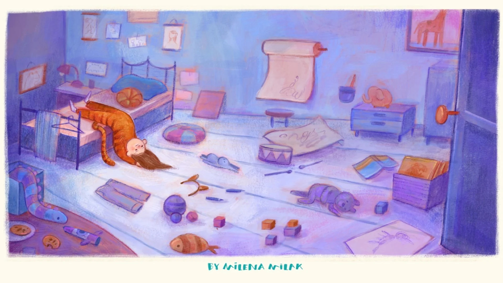
I consider this a success! I can't wait to work on more environments. Hopefully you picked up a few ideas that you can try in your own illustrations too.
If anything in my process made you curious, feel free to ask!
Until next time,
Mila
Quick recap:
Make sure every object in the scene adds to the mood.
Plan a foreground, middle ground and background to add more depth.
Use a complementary palette, and make your focal point the darkest, most saturated version of the accent color.
Check your values in grayscale with a black layer set to Color.
Keep contrast and texture highest around the focal point, and use a Multiply vignette if you need more contrast.